Published
Like many in the publishing industry, I arrived at my profession by somewhat of an accident. Sure, I loved books. But my interest was in classical history, with a deeper interest in the Roman Empire. Like others in that field, I studied Greek, Latin, Hebrew, and Egyptian (mostly Coptic).
In my initial studies, I learned the value of good typography.
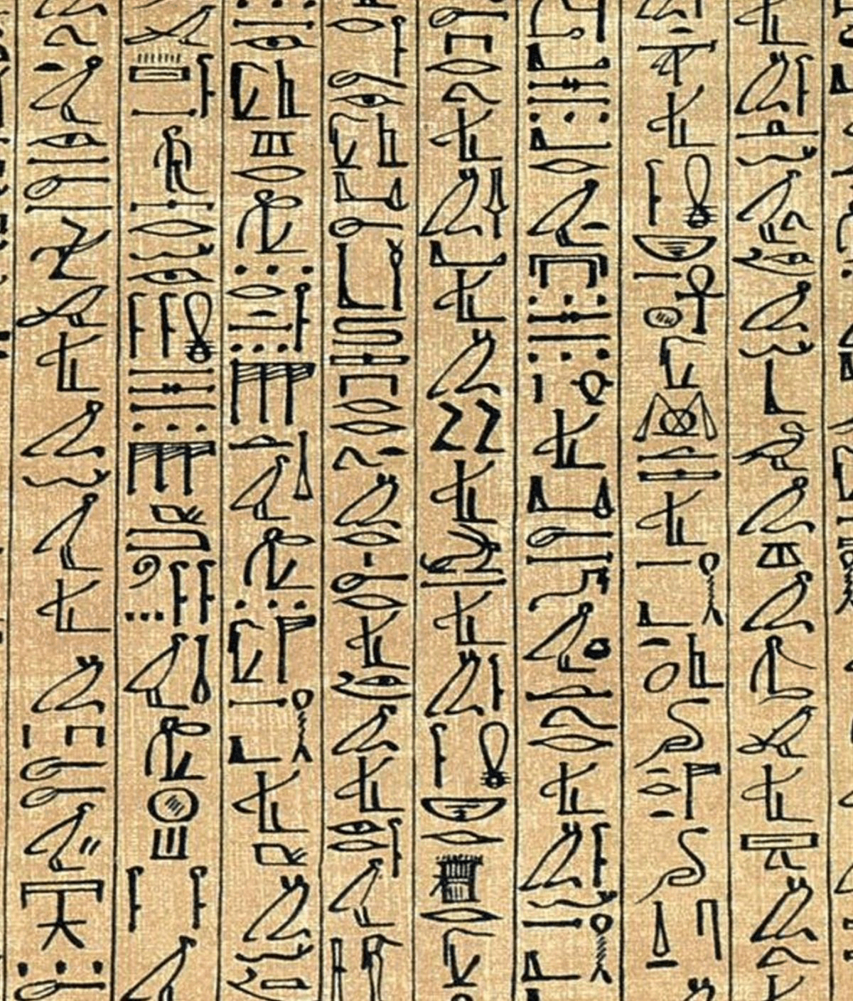
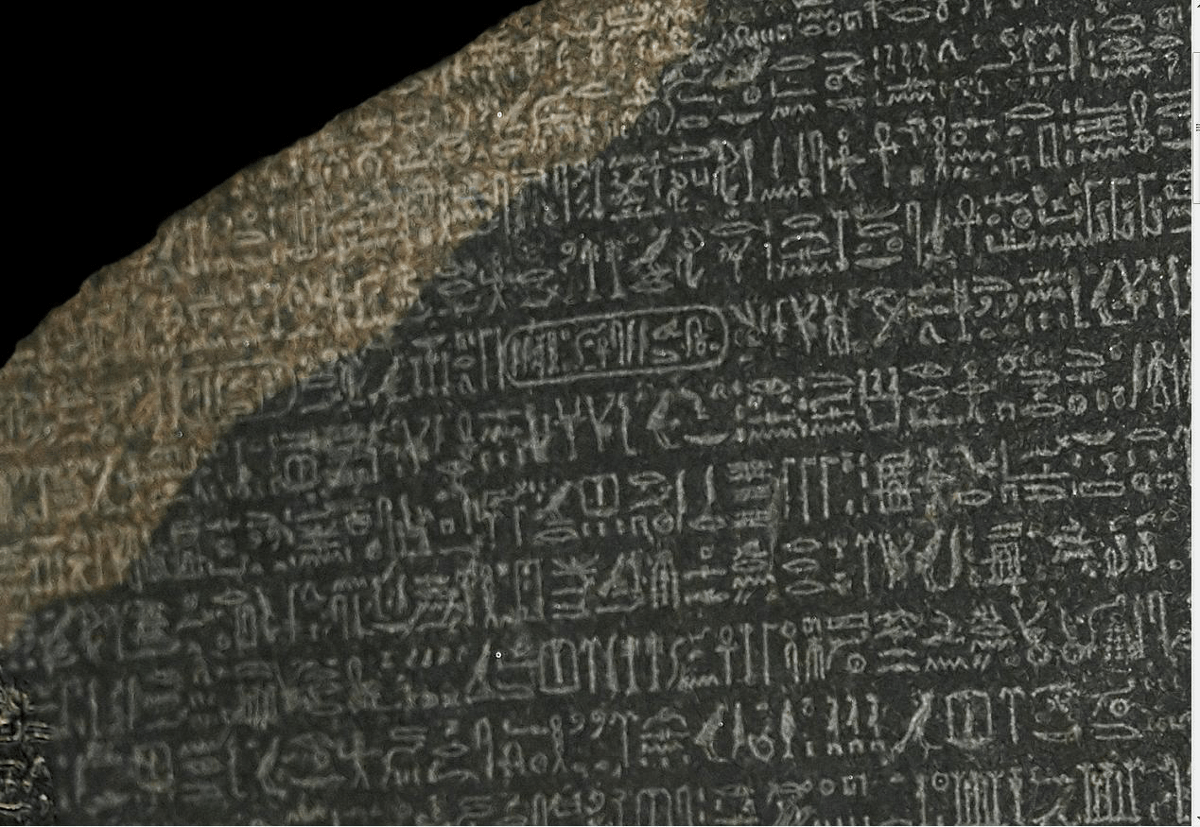
Though I was fairly adept at reading critical editions, I struggled with the originals. Though hieroglyphs point in a particular direction, often have predictable endings, and have other characteristics, I find monumental inscriptions and papyri almost impossible to read. I was so thankful for the cartouche, which indicated a name to be read phonetically instead of needing to be parsed whenever it appeared. (The cartouche made the decryption of the Rosetta Stone possible.)
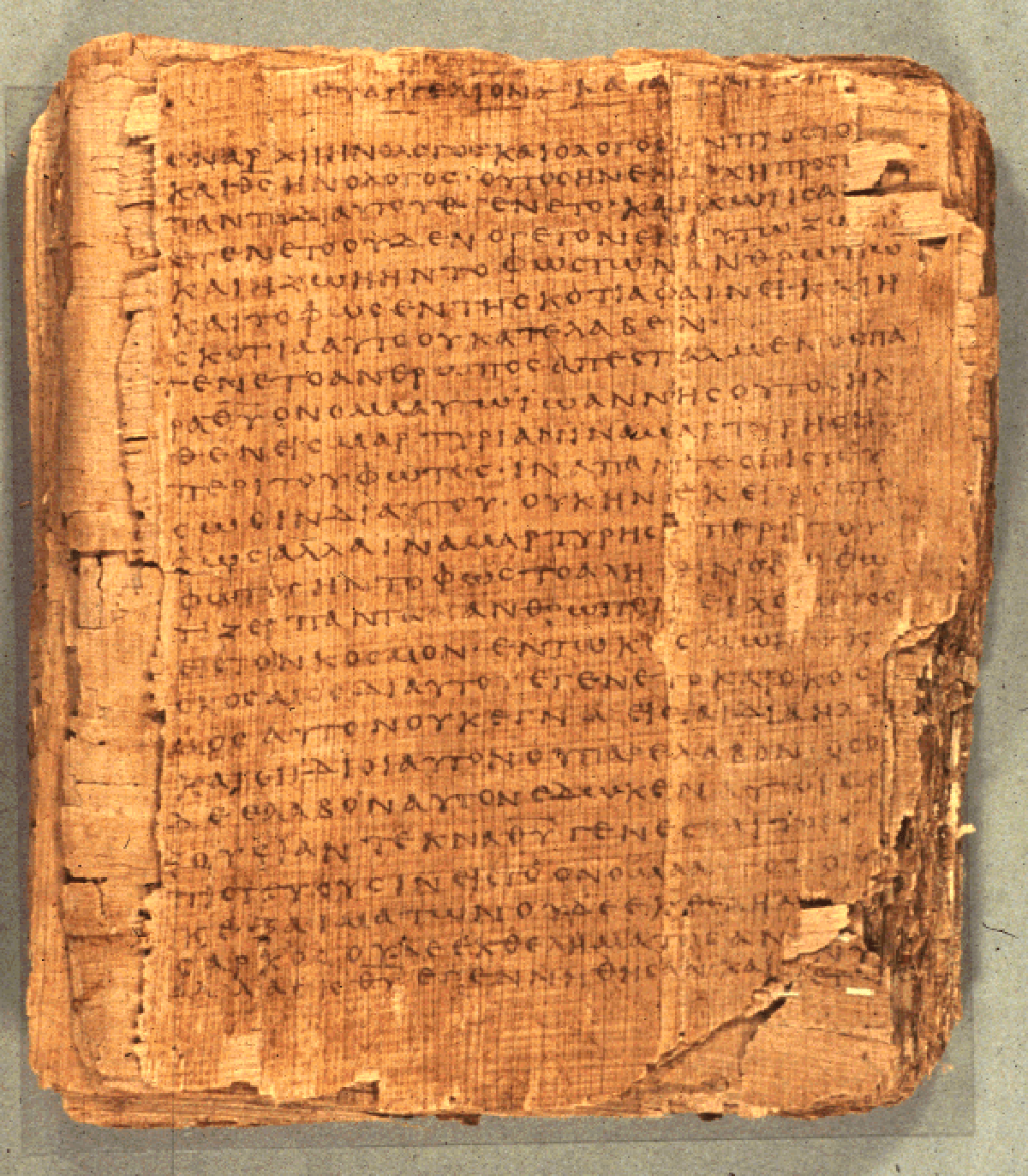
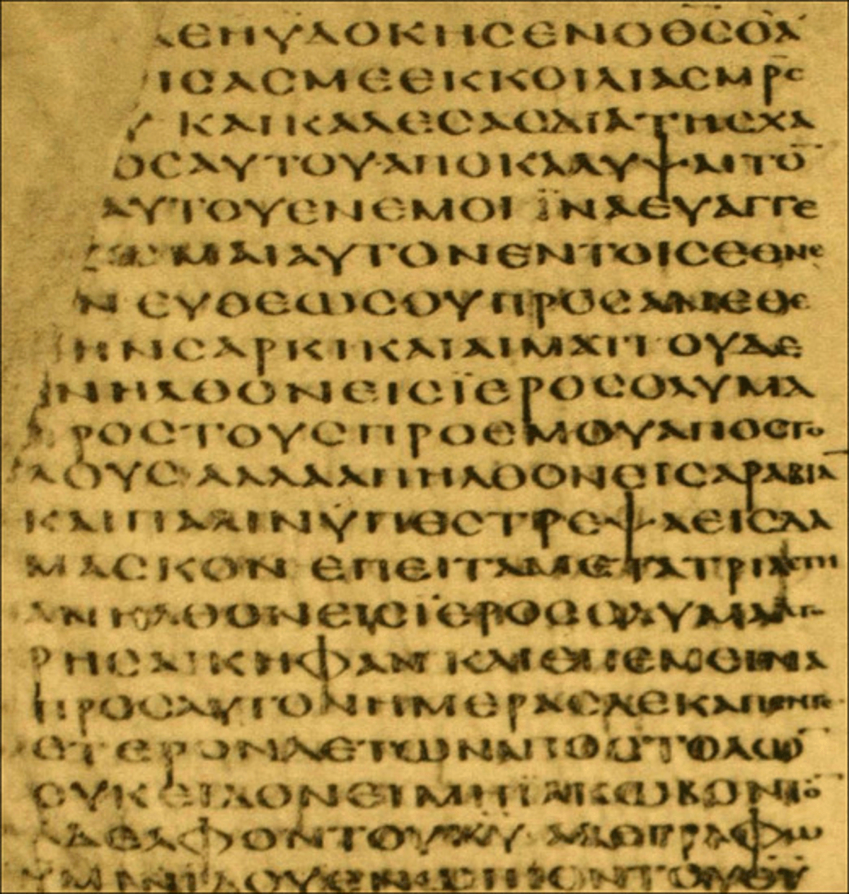
Greek manuscripts seemed even more difficult. I knew what direction to read (left to right) but could barely decipher anything else. Manuscripts from my area of interest were written in minuscule letters, with no punctuation, spacing, or even regular breaks. Lines merely broke when space ran out, usually in the middle of the word. For me, what made these texts difficult to read was the fact that I was unable to determine where one word ended and another began. Worse, it seemed impossible for me to decipher sense breaks like clauses, sentences, or paragraphs. Even if I could make out individual words, it remained difficult to determine where strings of words should be grouped.
I was always thankful to have a transcription where the words were clearly delineated and sentences or paragraphs were indicated. In these cases, the conventions that have been developed to make written information comprehensible make sense. Returning to the cartouche (still my favorite design convention), a ring around the word tells me that this is a proper noun to be read phonetically and seen as separate from the surrounding text. One of the clues for deciphering Egyptian came about because Champollion could tell where names were mentioned on the Rosetta Stone.
Another major practice that I appreciate is the space. The space provides us with clues about where words begin and end. And so it is with all conventions that have developed over the years.
We have created punctuation to indicate thought groups—-like sentences, clauses, or separate concepts. The punctuation also helps to indicate whether something is declarative or interrogative. Eventually, we developed section heads. They forewarn us about upcoming topics and thought groups. The spacing and indentation that we use around heads indicate where one concept ends and another begins. They also tell us which paragraphs are to be associated with each head.
Below are fabricated replications of various print methods using the first chapter of Genesis.
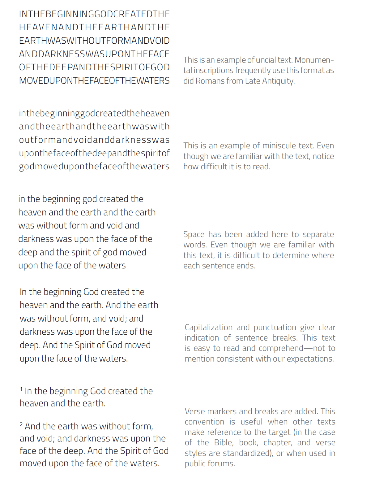
Here, we can see a clear progression of how text becomes more readable as each convention is used. The elements of good design and editing are employed to make the text more easily read and, in the case of the last example, shared and referenced within a community.
The typographical and editorial conventions that have developed are more about expressing logical organization than purity of language or design. The main purpose of these conventions is to make the information that we are reading more easily comprehended and intuitively digested. An example from mediaeval Europe is the illuminated chapter opener. When paper was precious, moving from one thought unit to the next often came on the same page. The convention of marking the beginning of a chapter with an illuminated character became commonplace. This indicated when one thought topic ended and another began.
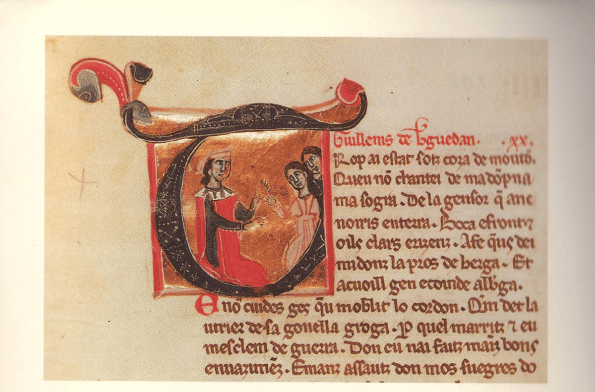
On paper, in this example, the use of ornaments aids in the comprehension of the materials. Preserving the convention in modern applications, however, may do the opposite. In a reflowable e-book, beginning a chapter with a large ornament actually interferes with reading as well as potentially limiting the ability to search for a word (if you use a graphic for a letter, then the word will not match a search). Thus this convention may not be necessary today, where we tend to begin chapters on recto pages following the chapter number and title. In this case, the special treatment afforded to the first paragraph of a chapter seems unnecessary. With or without an ornamental capital letter, I can clearly discern where the chapter begins—-and with that ornament, my e-book reading is choppy.
The editorial and typesetting standards we apply are not arbitrary. They have developed over millennia to enhance our ability to follow and comprehend what is rendered on the medium through which we read. These rules, however, are not canonical, and they are certainly not fixed. Consider, for example, the use of the underline. In older books, this indicated a reference or emphasis and functioned in similar fashion to slanting letters that we use more often now. In electronic arena, the underline indicates a hyperlink. To use it to mark a book title in contemporary works would be distracting and could cause confusion.
In editing, proper (i.e., consistent to a known and predictable rule set) spelling, grammar, and punctuation lead to clarity of understanding. Consider Lynne Truss's famous example of Eats, Shoots & Leaves. Her intolerance is not because she wants everyone to blindly adhere to the rules. Her position is that we should clearly state what we mean.
In typesetting, good design (i.e., known and predictable arrangement of information) improves reading comprehension and engages the reader in the subject. When content is arranged according to predictable (or intuitively understood) patterns, reading occurs effortlessly. Altering design or bucking conventions is often jarring. The works of E. E. Cummings are good examples of this. Occasionally, we wish to achieve this unconventionality, but this results in readers being taken out of the narrative. Most of the time, our intention is to fully engage the reader—-to draw him or her in. We want to design in ways that hold the reader's attention and make the book a better read.
Given the changes in book technology, it is important that we start to consider the use of editorial and design elements in both print and electronic mediums. We should no longer hold to convention as if it is canon because many of those conventions are disruptive to the reading experience. We should consider each editorial and design choice to determine whether our style decisions are helpful or distracting. We are, after all, trying to enhance the experience of our customers.